New Brand Design
SEF Centre
SEF Centre is a newly formed fitness brand that provides fitness training videos along with other content relating to mental and physical well-being for its clients. The brand will also have the potential in the future to produce its own clothing line.
I was tasked with creating a new logo to bring together the brand values of SEF Centre. The client requested that the logo should have a unique icon that relates to the brand whilst also remaining fashionable and trendy since the logo was planned on being used for a clothing line in addition to its regular content.
Agency: Before Lucy
Software specifications: Adobe Illustrator, Adobe Photoshop
Software specifications: Adobe Illustrator, Adobe Photoshop
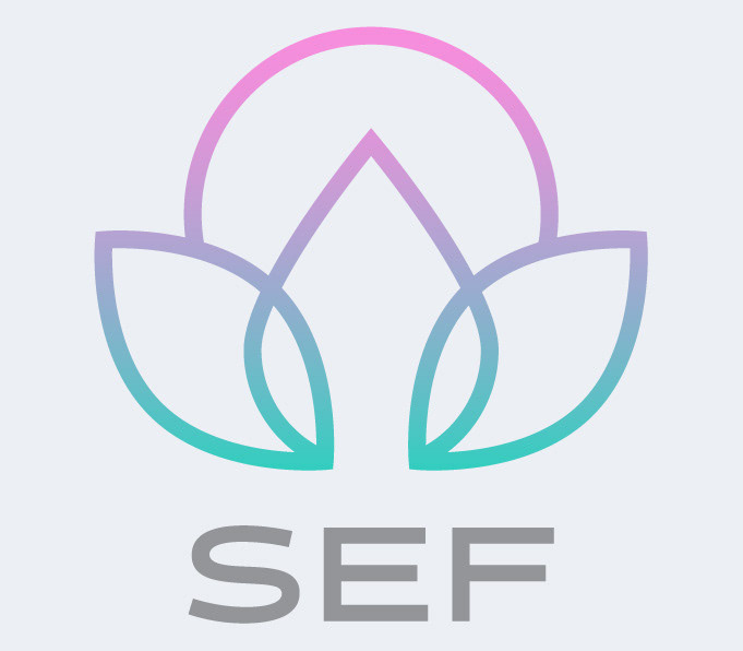
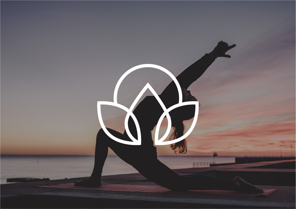
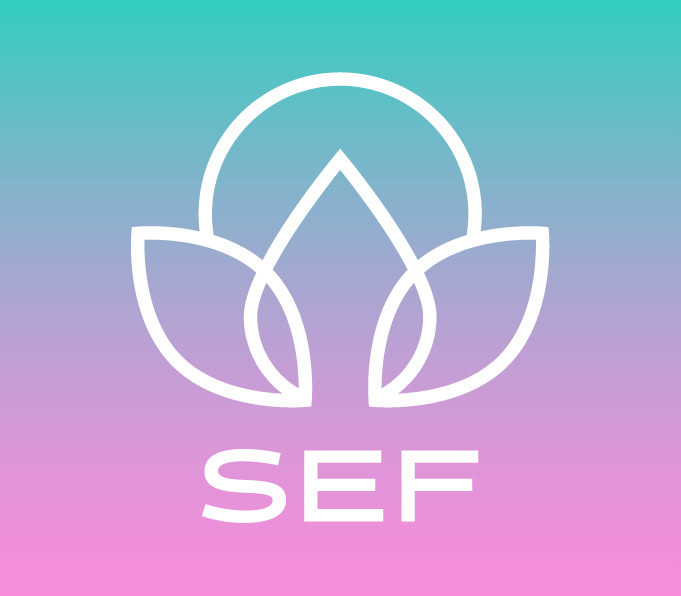
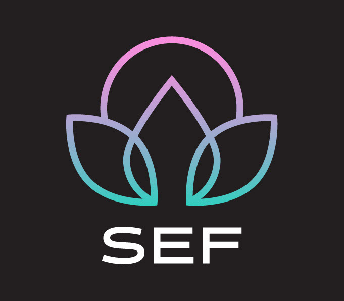
Main logo design. This idea took its main inspiration from a lotus flower, a symbol of purity and self-regeneration. The three petals point towards the three initials of the brand: SEF along with a circular image in the back that can be interpreted as the sun, a source of energy that synergises with fitness and exercise.
I also developed other concepts for the client before the main lotus flower design was ultimately chosen. (As seen below.)

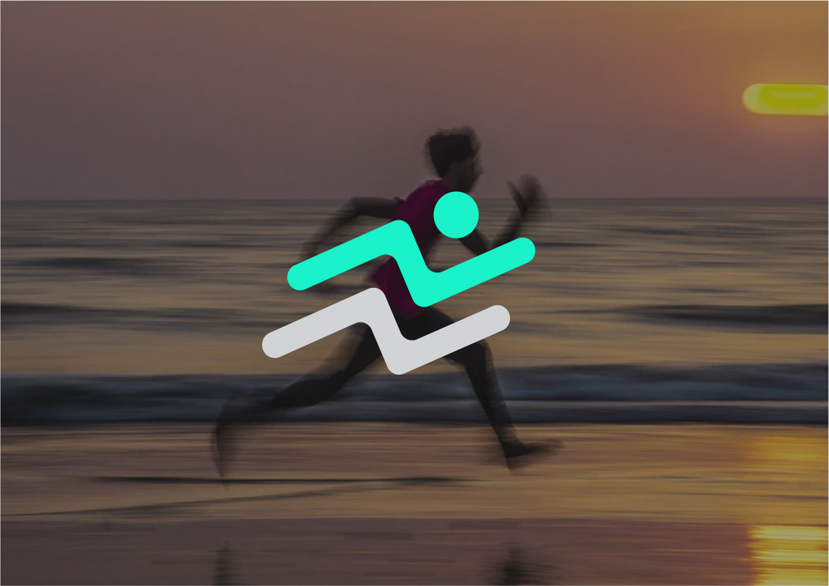
This concept took a more simplistic yet highly recognisable and effective logomark. It takes the shape of a running figure, which can also be loosely interpreted as lighting bolts, a form of energy and momentum that fitness is a large part of. The complementary colour palette is another simple yet highly effective mark of the brand that can be applied across many forms of media.
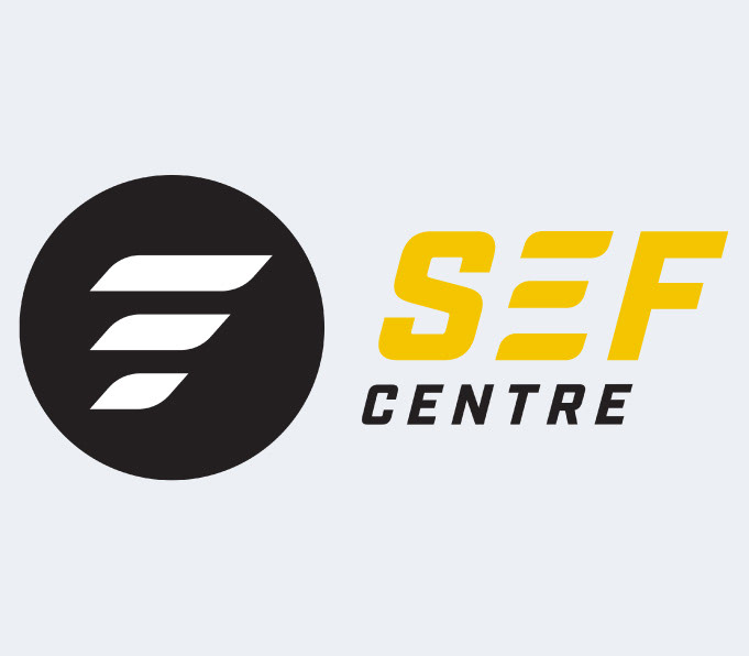
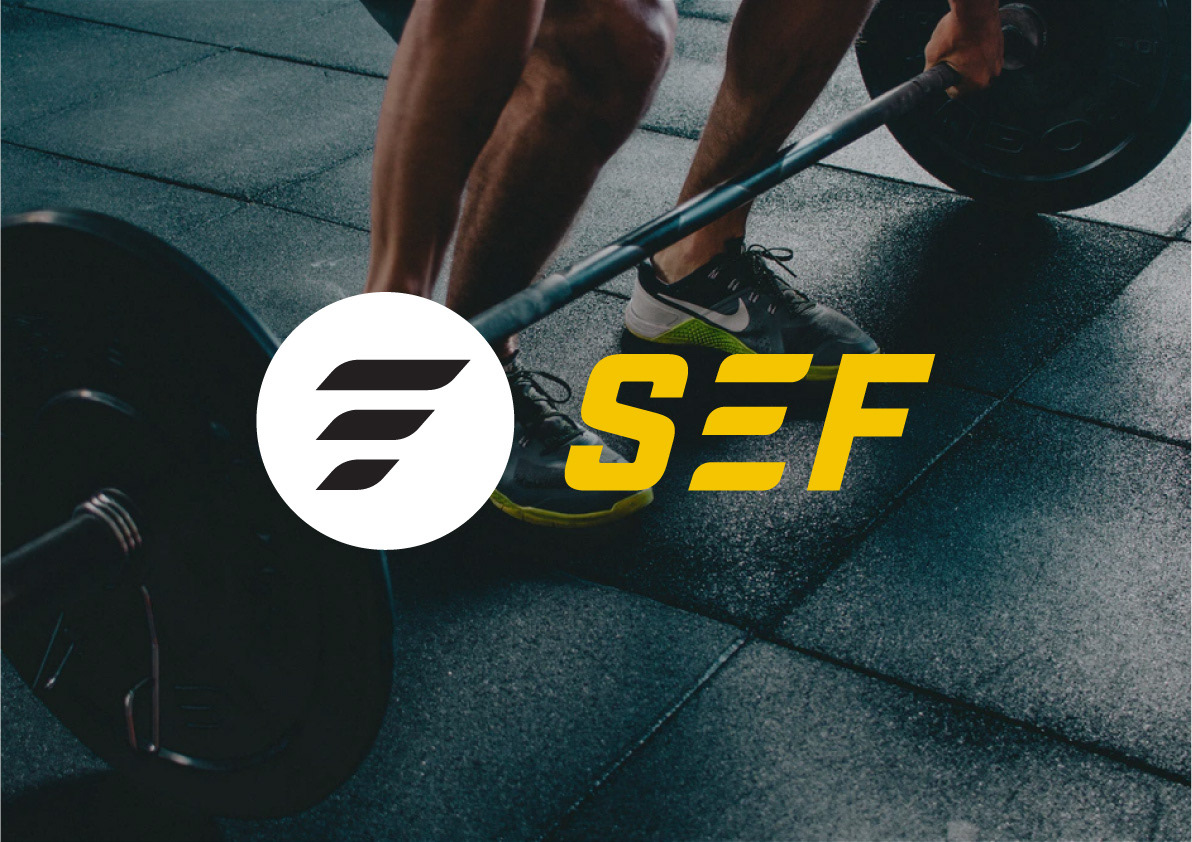
The logomark was developed from the idea of momentum or moving forward, indicated by the slanted lines, great importance to progressing in fitness. The mark is also connected to the ‘E’ in the typeface so that the icon can be easily recognised even without the type being displayed. Lastly, the three horizontal lines also connect to the three initials of the brand, SEF.
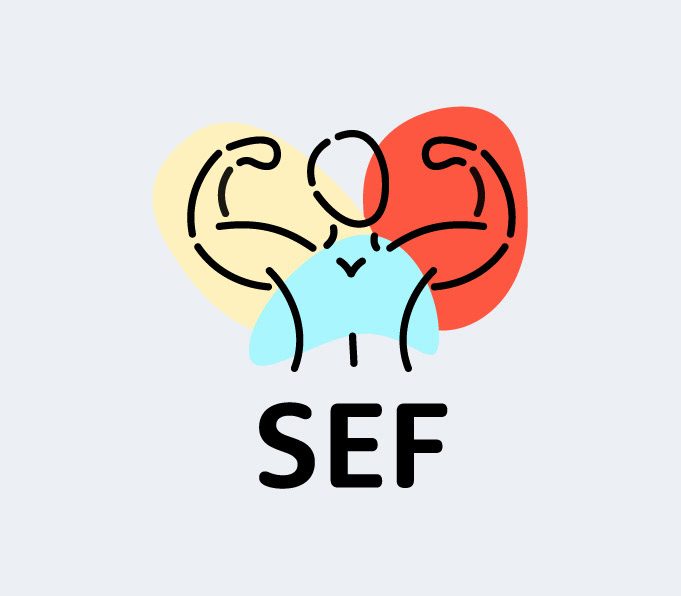

Similar to the previous concept, this is another direct interpretation of the brand. But instead of a single-arm, this design shows a broader view of a flexing person. The areas of colour are loosely referring to a focus on different areas of the body. Again this can be interpreted as sculpting the human body with everything that SEF Centre has to offer.